Plotly Ice Hockey Dashboard 🏒📊
I recently built a fully interactive, self-hosted ice hockey analytics dashboard using Plotly Dash, Python, BigQuery, and Azure — tailored for exploring game data, team performance, and player stats.
You can check out the live version here:
👉 Ice Hockey Dashboard – Mackan’s Hockey Hub
Why not Power BI or Metabase?
Business Intelligence (BI) tools often come with a heavy price tag. For example, Power BI will cost you around €120 per user per year—at best—even if you’re already embedded in the Microsoft ecosystem.
That can be a tough pill to swallow, especially for startups and scale-ups where budgets are tight and team sizes are still evolving.
Lightweight Alternatives
There are lighter tools that sit “on top” of your database:
- Redash and Metabase are simple and fast to implement
- Grafana is great for real-time monitoring and time-series data
- Datadog, App Insights, and other observability platforms offer basic visualizations too
However, most of these are limited when it comes to interactivity, complex filters, and full UI customization.
Why Plotly Dash?
I needed:
- A custom user interface
- Fast, interactive filtering
- Backend control with Python logic
That’s where Plotly Dash shines — it gives full flexibility while still being relatively lightweight and Python-native.
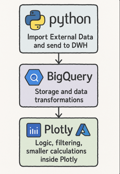
The Setup
Here’s how the whole system fits together:
- Python script pulls external data (daily)
- Data is sent to Google BigQuery as DWH
- Scheduled queries in BigQuery transform and aggregate it
- The Plotly Dash app, deployed on Azure, fetches the data and applies logic, filters, and visualizations
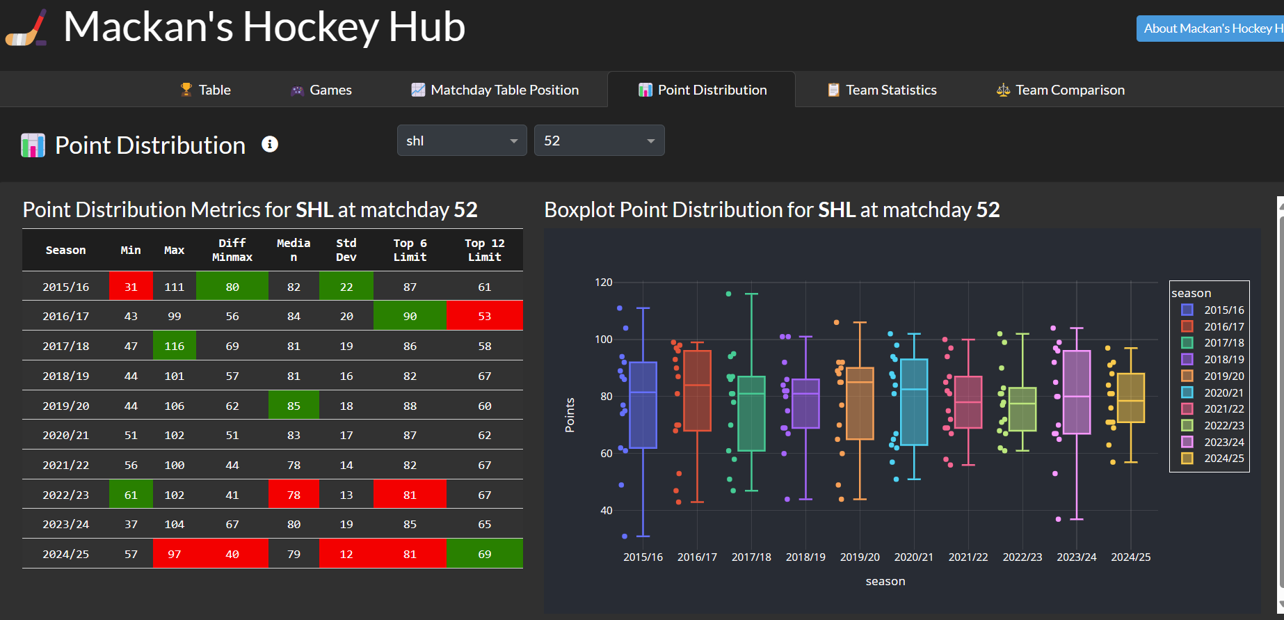
Screenshots
A few examples from the dashboard:

Got questions, feedback, or want to build something similar?
Feel free to reach out — always happy to chat dashboards, data, or hockey. 🏒